Please head to help.myintervals.com for help articles and guides. If you have any questions, please contact our support team.
-
- thelem
- Feb 25th 2010
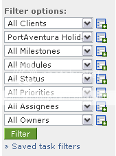
On the tasks tab (and others I think) there is a box on the left of 'filter options', with 8 dropdowns. Normally, I will have 6 or 7 of these set to the default, and one set to a specific client/project/whatever.
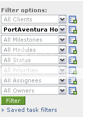
The problem is that it is not obvious at a glance which options are selected, and which are set to "All xxx". I'd suggest a simple style change, e.g. slightly grey out the 'All' options, or make selected options bold. -
- Michael
- Mar 19th 2010
Thanks for the feedback. Currently whatever filter items have been selected will show up at the very top of the task list.
For example:
10 Tasks
Alliance; Web Maintenance 001; Review w/Client; Owned by Michael Payne
The thinking is to display the parameters up top while allowing a new filter to be run. If you haven't already done so you may want to tinker with saved tasks filters. Saving task filters can help quickly change up preset views of the task list. -
- thelem
- Mar 29th 2010
It's fine when I'm looking at the options in a particular dropdown, my comment was about when you are looking at all 8 dropdowns as a group.
For example, what are my filter settings in this screenshot:
What about in this screenshot:
1 to 3 of 3
Comments are closed.
For more Intervals help documentation, please visit help.myintervals.com
