
In this post…
One of the biggest hurdles in designing and printing a shirt to promote your online project management software is creating something cool enough that people will actually wear it, and preferably not just at the gym. That means great concept, great artwork, and less logo. If you are going to ask your customers to be walking billboards, choose subtlety over conspicuousness. We challenged ourselves with this lofty goal on our second round of Intervals shirts. We thought it would be fun to share the process so you can see how an idea transforms from a sketch into a wearable shirt.
Conceptual Phase
 Intervals is an online time, task and project management application that enables our customers to achieve both an “in the trenches,” detailed look at their day-to-day workflow and an “above the clouds” perspective on the overall health of their business. And, although Intervals is technically “in the cloud,” we wanted to convey this metaphorically without resorting to images of clouds that have become so cliche on the web.
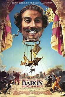
The idea of including a dirigible was the easy part. The hard part was figuring out what to suspend from the dirigible. All of the ideas we came up with — bicycle, ship, car, etc. — have already been done, and don’t fully capture the core benefits of Intervals. When we thought of a submarine, it all came together in a Terry Gilliam-like vision. It was time to start sketching out some ideas and looking for an illustrator.
Rough Sketches
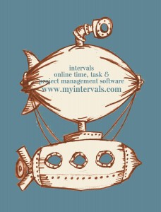 To begin the visual phase, we started scouring online illustration stock sites and the cartoon pages in the newspaper. We soon found enough material to put together a rough sketch for our yet-to-be-chosen illustrator. I may have majored in graphic design in college, but I am no illustrator. I drafted up a rough sketch, and while doing so, came up with the idea of punching the periscope up through the air balloon. We had it! A crappy napkin sketch that visually captured the message we wanted to convey. Now it was time to find an illustrator.
Hiring an Illustrator
 We had a sketch, and we knew we wanted the design to be a two-color design, with the shirt color acting as a third-color, to keep the shirts affordable. We also wanted to avoid the cartoon imagery that has plagued web 2.0 company’s web sites and promotional materials, we wanted something more authentic, real and gritty. We began the search for an illustrator by reaching out to Scott Anderson, a local illustrator and friend, with our idea and requirements. He was polite enough to turn us down, explaining his style wouldn’t match the two-tone illustration style we were after. He suggested we reach out to some illustrators from illoz.com, where we could find an illustrator who’s work was more aligned with our ideas.
It did not take long to stumble upon the work of Michael Cho, an illustrator who specializes in two-tone illustrations. One flip through his portfolio and we were hooked. We reached out to him with our conceptual sketches and struck a deal to work with him.
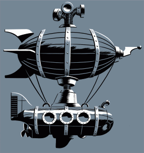
Working with a professional illustrator was a great experience. Michael nailed 99% of the illustration on the first rough. It took only two more minor iterations to end up with the final artwork. He delivered exactly what we wanted, a submersible dirigible with a retro-victorian, Terry Gilliam feel to it; an illustration that would translate perfectly to a shirt.
Preparing the Illustration for the Printing Process
Once we received the artwork we had to do two things before having it printed. First, we needed to do the color separations in Photoshop. From the scans of the original painting we were able to isolate the two colors onto separate layers. This saved both the illustrator and the screenprinter some work. Second, we added the insignia to the submarine — SS Submersible Dirigible.
Finding a Screen Printer
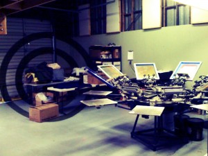 Not only did I put myself through college as a screen printer, I’ve worked with a lot of them since. I knew our design was going to be difficult to print the way we wanted it to look, which is not too heavy, or too light, on inks, and in a way that would blend into the shirt, not contrast with it. I started talking to Curt Crawshaw at Foundation Press and he immediately understood what I was talking about. He also happens to be a talented illustrator and was familiar with translating great illustration work to shirts without diminishing the artwork.
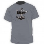 We met with Curt and he took the time to walk us through the entire process and even comped up in Photoshop how the final product would look. He explained how he would alter the dark and light inks to complement each shirt color and helped us pick out the best colors and sizes. We left him with the Photoshop files of the final artwork and waited to hear back that the shirts were done.
Shirts Delivered
We drove out to Foundation Press to pick up the shirts, four boxes of them, and brought them back to the office. They looked better than we could have hoped. The print is crisp and clear, and complements the shirt colors perfectly. And the retro-victorian style of the illustration is balanced well by the vintage look of the screen sprinting. My first response when I saw them was “these look like something you’d buy at Urban Outfitters.” Fortunately, our customers won’t have to buy them. Drop us a note if you’d like one. You know where to find us ;)
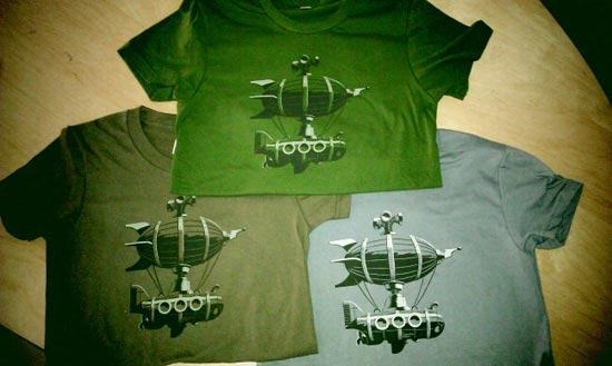


I love my new submersible dirigible shirt(s)…nice work!!!
Intervals is the way we track our hours for billing and invoicing. It’s indispensable for this purpose.
Now I hear you have a t-shirt. Well I’d have one if you’re giving them away. I’d be an Xtra large I reckon.
Reade,
Yes, we are giving them away. Login to your Intervals account and click on the feature request button at the bottom of the page. Tell us what size shirt you would like and where to send it and we’ll drop one in the mail to you.
This is brilliant!
I had a long beer enhanced conversation on airships and submarines and concluded that the absolute ultimate would be nothing less than the submersible-derigible!
A quick search on the concept brought me here.
Bravo. Nice design.