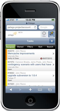
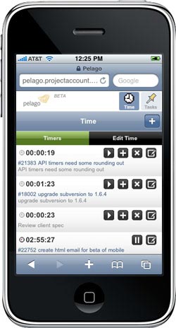
 The Intervals Mobile UI launched 7 months ago. In that time we’ve been collecting feedback from our customers and using it quite a bit ourselves. We’ve also been busy architecting the next few features, which will include more client, project and milestone management.
In this post…
When we originally launched the mobile UI, we wrote about what it does, how it works, and how to use it. What we didn’t address is why we built it the way we did. More specifically, why we built it using HTML, Javascript, and CSS, and not as a native app. 37signals recently launched a mobile UI for Basecamp and in their blog did a great job of explaining why they took the same route, shunning native apps for a more ubiquitous mobile browser experience. They go on to explain their reasoning and the process in their blog post, Design Decisions: Basecamp mobile UI. It’s a good read for anyone getting read to tackle the task of designing and developing a mobile experience into their web-based application.
When we first started sketching out ideas for the mobile UI, we had to decide if we were going to develop it as a native app for iPhone, Android, and other mobile phones, or if we were going to develop it in HTML and make it available on any phone with a capable web browser. We went back and forth a lot before finally settling on developing the mobile UI in HTML. The reasoning behind our decision parallels that of 37signals, and many other web designers and developers targeting a growing number of mobile devices entering the market.
Why not design and develop a native app?
 I’ll admit our first inclination was to develop a native app for at least the iOS and Android operating systems. Running Intervals on your mobile phone as a native app just sounded cool. The practicality of developing such an app, however, proved to be an impenetrable barrier.
Problem #1: Learning a new technology
Developing a native app for the iPhone was daunting enough, especially for a group of web developers whose strengths like in web technologies like PHP, HTML, CSS and Javascript. Throw Android, and possibly Windows and Blackberry, into the mix, and you have several apps to develop, each with it’s own learning curve. Yes, there are apps out there that enable developers to write one app and port it to several different devices. But those apps come with their own learning curve and obfuscate the code in such a way we have no idea what’s going on under the hood.
Problem #2: The app ecosystem
Say we finally did develop a native app for the iPhone or Android. It could take anywhere from a few weeks to a few months to get the app approved. And then we’d be entirely dependent on the app ecosystem, and subject to whatever demands they decide to make. Why be subject to the restrictions of the app ecosystem when we’d be giving our app away for free?
Problem #3: Supporting multiple devices
There may be only one iPhone on the market, but there are more Android devices than I can count. Launching an app for Android would mean fielding bug requests specific to various devices. These bugs would be impossible to replicate and fix without having the same device.
Problem #4: Discontinuous integration
We employ a method of development called continuous integration, which allows us to rapidly design, develop and deploy new features in our app. Because we are in a constant state of development we can quickly respond to customer requests and bug submissions. A native app would completely disrupt this process.
Embracing the mobile web browser
 Once the barriers to going native became more evident, we joyfully embraced web technologies and began brainstorming how we could incorporate the latest web design and development trends into our mobile UI. The reasons in favor of going this route began popping up faster than a Chuck E. Cheese Whac-a-Mole fervor.
Use what we know
We’re web developers. We’re like the A-team, but instead of brute strength, good planning, good looks, and pilot skills, we know PHP, HTML, CSS and JavaScript. It made the most sense to stick with what we know, especially considering the promises of HTML5. And by using the same technologies as our web-based project management application, it would be incredibly easy to develop a mobile UI atop our existing online app.
Adding a mobile UI to our existing web-based application
In addition to an existing web-based application, we had a fresh new API useful for getting at the raw data. What better way to test and promote our API than to build our own mobile app to use it? The Intervals API made it extremely easy for the mobile UI to use AJAX, making the mobile experience a fluid one that required fewer page loads. The result would be a snappy interface due to faster rendering times, and less time waiting for a blank white screen to display something useful. The web browsers on most mobile devices are powerful enough to deliver the rich user experience we wanted.
Works on multiple devices out of the box
The best part about developing the mobile UI? We were able to target just a few web browsers common to most mobile devices. There would be kinks to work out for the iPhone and Android, but we didn’t need to get our hands on too many different devices to debug the mobile UI. Between emulators and friends with different phones, we would be able to launch a compelling mobile experience with fewer bugs.
HTML5 came out at just the right time
 HTML5 landed in our laps while we were developing the mobile UI. The Webkit rendering engine on the iPhone and Android phones both support HTML5. This allowed us to use features to make the mobile UI faster. For example, we were able to use the Javascript localStorage object to cache data on the mobile device, rather than repeatedly requesting it from the server. And we’re able to use CSS3 to render visual elements usually requiring graphics, such as gradients.
Full control over release cycle
As a web design and development agency that practices agile development and continuous integration, we need to be able to deploy updates to our mobile UI as often as we do our primary online project management application. We can fix bugs and update the mobile UI as soon as we find a bug. And we can respond customers requests sooner by avoiding large releases, focusing instead on smaller, iterative releases. For an online app like Intervals, which continues to evolve with each release, we need a medium that allows for spontaneity. The web is that medium.
Did we make the right choice?
Yes, we did. And seeing web veteran 37signals announce their decision to launch the Basecamp mobile UI in the same way further confirms we made the right choice for our mobile app and our customers. I’m not saying all mobile apps should be developed in this manner, I’m saying it’s important to weigh your web design and development options carefully. Don’t use a technology just because it’s the latest and hippest thing being blasted on the interwebs. Evaluate your options and choose the right technology for the job. Otherwise, you’ll waste a lot of time building something that may require more work to update and maintain than it’s worth. Meanwhile, HTML5 is just going to become a more ubiquitous standard as new mobile devices continue to hit the market.


I just got my hands on your project management software and I fell in love. Good work on INTERVALS.
Of course since I have an Iphone I was looking for the app for your software but could not find it… Now that I read this article I understand why there are not app for it and your decision to take the route you took.
thanks
Philippe
Firstly, I’m a strong supporter and user of Intervals – it wins on features hands-own over Basecamp, etc – I’ve tried most and have used Intervals for at least 5 years now.
That said, I have been frustrated for a long time that an App is not available. I appreciate the fractured state of the mobile market, and have used the mobile site but with all due respect, it is not as intuitive as I have hoped, and therefore not used. The task our studio requires most for the mobile site is to add times at the end of the day if they’ve not been entered during the day. this is on the train, in an ad break of a tv show, etc.
I’ve found there are too many layers to get to entering a time and I’ve given up using this method and stick to desktop, which is a pity.
I would be far more supportive if there was a simple, less click-intensive method of adding time that didn’t take you down too many layers. A simple pop-u would solve all of this. hopefully its something Intervals Dev will consider in the future?
Demi,
Thank you for your input. It is greatly appreciated. Yes, the mobile version of Intervals is not perfect. We do have plans to overhaul the mobile experience to make it more rich and intuitive. Our goal is to bring more features over from the desktop experience, such as project and milestone management, and also make the time tracking and task management more streamlined, much in the way you’ve implied in your comment.
We don’t have a set schedule for when this will happen, but it is in our grand plans and we’ll be sure to publicize the mobile experience once we’ve redesigned it.
Thanks, again, for taking the time to share your thoughts with us.
John