“We’ve been constantly impressed with not only existing functionality and ease of use, but also the continuous improvements being made and the responsiveness of support staff.”
In this post…
Katelyn Taylor
Mezzanine Consulting
The recently scheduled upgrades were successfully launched last weekend. As promised, here is an update detailing some the exciting new features and improvements that were launched.
Export your time to QuickBooks using QBTimer
 For those who use both QuickBooks and Intervals you can now export IIF files from the Timesheet, Edit Time, Summary Report, and Project Activity Report. Use this feature to import your time data into QuickBooks to generate invoices, run reports, and do payroll. To utilize the functionality QBTimer must be installed in QuickBooks and your Intervals account must be configured under Options -> Settings & Defaults -> QuickBooks.
Please note, there are some requirements for using this feature that are explained in the integration guide.
» Read the guide for QuickBooks integration using QBTimer.
HTML / rich text upgraded on Safari and Chrome
![]() The advanced editor is now available on both Safari and Chrome. Die-hard Safari and Chrome users can now update tasks, project notes, and other information with enhanced text formatting. The advanced editor also includes a spell checker, the ability to paste from Word, and edit source for more powerful HTML formatting.
The advanced editor is now available on both Safari and Chrome. Die-hard Safari and Chrome users can now update tasks, project notes, and other information with enhanced text formatting. The advanced editor also includes a spell checker, the ability to paste from Word, and edit source for more powerful HTML formatting.
Address field modifications
 We’ve loosened up the formatting for address fields. Once confined to individual city, state and country fields, the address field for clients and people is now one text area. We found the previous address structure was hindering our international users, so we opened it up and are giving you full control over the formatting.
Widescreen task list
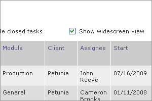
 The task list has a new option labeled “Show widescreen view.” This option has been added on behalf of our customers who’ve been asking us to display additional columns in the task list. We chose to have two different views to accommodate discrepancies in screen resolution. The default task list view will work with a minimal resolution of 1024 x 768, while the widescreen task list view was designed with larger screen resolutions in mind. Selecting the widescreen checkbox will display Module, Client, and Task Start Date columns on the task listing.
Enhanced invoices
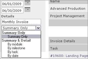
 Invoices based on actual work performed often require a bit of tuning to get them finalized and presentable. We’ve added a Preview and Save feature when creating invoices based on actual work performed. The Preview step allows you to fine tune the invoice details — date range, title, criteria for line items, and whether or not to include time entries and fees — before saving the final result.
Until now, the only option available for invoices based on actual work performed was to break down line items by work type. Not anymore. While prefilled invoices do still display a summary of time billed by work type, the line items can now be broken down by module, milestone, task, or date. Or, keep your invoices simple by including only a summary of time billed. Either way, the choice of how to bill your clients is now yours.
» Read more about creating advanced invoices in our forums.
View time summary by work type, module, or person
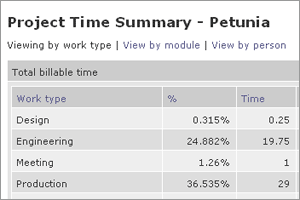
 The Time Summary page, which can be found by navigating into a single project and clicking on Time Summary from the left column, has been updated with additional views. Billable and unbillable time for any given project can now be broken down by work type, module, or person. This feature is especially useful if you want to dissect a project by the types of resources it is consuming.
Miscellaneous debris
As is usual with these updates, we’ve optimized Intervals more for speed, added a few miscellaneous features and resolved minor bugs. The Edit Time page has been further optimized to run faster and the administrative level user has been updated to see all projects throughout the application. We wanted to introduce more consistency for the administrative level user. It used to be that on some pages this user would see all projects, while on other pages they would see only the projects assigned to them. From now on, administrators will see all projects, regardless of what is assigned to them. This should clear up any issues with an inconsistent interface and make it easier for new administrators to get up and running with Intervals.


