In this post…
We launched Intervals just over ten years ago. Since then, the software has steadily grown into the full featured online project management software that it is today. And with customers all around the world, we get a lot of positive feedback — our customers have been indispensable in helping us decide which features to add, and how to improve existing functionality.
We’ve also received our fare share of constructive criticism. More recently, a common thread we’ve been hearing from our customers is that the current interface is beginning to feel dated. They would like to see a more modern interface design. “Like a house with good bones,” one customer shared, “Intervals could use a remodel to bring it up to date.”
We see criticism as an opportunity to grow, and we agree wholeheartedly with our customers on this one. And so in 2017 we begin the journey of modernizing the Intervals time, task, and project management UI. This post is to give everyone a sneak peak of what we’ve been working on, and to let you now how we’ll be rolling out the new look.
The creative process
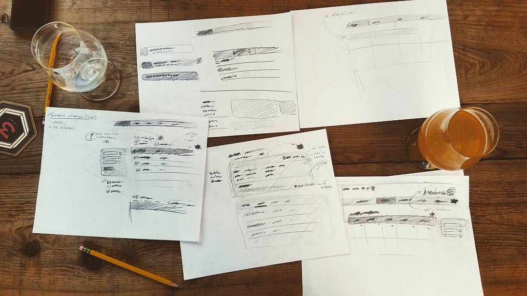
We began the task of modernizing the UI where we would begin any design project — reviewing our customer surveys and researching current trends in UI design. Inspired, we headed to the local brewery with a handful of pencils and a stack of papers. The words we carried on our minds were “clean,” “crisp,” “modern.” We iterated on the basics in sketch after sketch, honing the universal UI elements such as navigation, buttons, lists, forms, and icons.
This first redesign is an evolutionary step, not a complete overhaul. The focus is on cleaning up the UI and improving some of the interactive elements. We will introduce the new design in phases, as to not overwhelm our customers, but also, to implement your feedback along the way.
A sneak preview
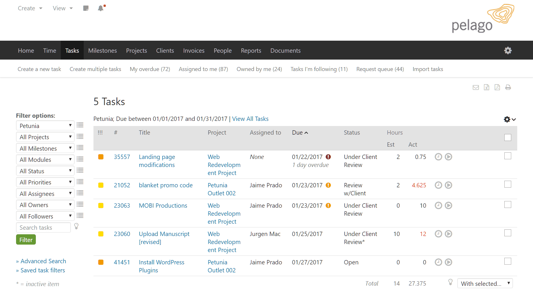
Good research and plenty of refined sketches are all you need to tackle the code and begin realizing your vision. Most of the time allocated to this project has been focused on HTML and CSS. The above screenshots show the current state of the new UI design. While the layout is much the same, the overall design reflects the clean, crisp, and modern look we are moving toward. Just a few finishing touches remain before we’re ready to do a soft launch.
Rolling out the new UI design
We’ll be introducing the new UI design as an optional theme, which can be selected in the Settings & Defaults section of your account. We’ll let everyone know once it’s available and encourage everyone to try it out.
Once the proverbial tires are thoroughly kicked we’ll do a more complete UI overhaul, going deeper into the code and improving existing workflows while also making the interface fully responsive.
## Update ##
The new interface is available to beta test as a new theme. To test the “modernistic theme”, follow the instructions in this help resource.
Photo credit: Adam Wilson


Exciting to hear improvements are on the way. Does this also include improvements to the mobile interface?
We’re constantly telling our clients, your site should be mobile first and responsive. Any plans to do the same for intervals?
Overhauling mobile is on our radar after getting through the web interface. Please check out the roadmap here https://help.myintervals.com/roadmap-updates/. If you are interested in beta testing the design overhaul or mobile overhaul please contact support@myintervals.com
This is great!
I’m so late on this one. We just changed to the new theme and it looks way more modern. Good job! It would be awesome to be able to change the layout of the tasks page to a list style or a card format. It’s not a major factor in using the software (but would be nice) because it’s functional and has been working extremely well for our team for years.
Thanks Trena! And you are not late :). This blog post is a few months old but we recently started actively rolling out the beta and letting people know about it that have expressed an interest in trying it out.
With the Modernistic Beta them if you roll your mouse over the question mark icon in the header (top right) there is an option to send beta feedback. Feel free to send over any feedback and thoughts.
I will add your email to our official beta list as well. We will be following up with emails and a questionnaire to get more feedback.
Thanks again!
The interface has been officially released and is out of beta. Thank you again to everyone for all of the great feedback!
Here is a blog post on the new interface release.
https://www.myintervals.com/blog/2017/07/14/introducing-a-new-interface-modernistic/