Our goal with Intervals is to keep improving weekly. We have a lot of features and improvements on our road-map and we get new requests daily (often hourly) from the “feature request” link and the forum. We do not believe that “fully featured” and “easy to use” are mutually exclusive and we strive to keep Intervals growing and evolving while never turning into bloatware. As designers and developers this is definitely a challenge (supplemental reading: Featuritis vs. the Happy User Peak (still very relevant) and The Ambiguous Feature Request).
We shuffle the priorities around based on the feedback we are receiving and the overall “bang for the buck” of a given item. Sometimes we will fast track a bunch of minor improvements while other times we focus on a few big pieces. Earlier this year we shuffled around our development plan pretty substantially because the number of Intervals users doubled over four months. This growth in users made speed, performance, and scaling the most important priority.
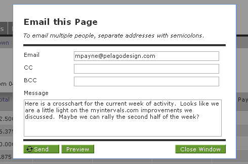
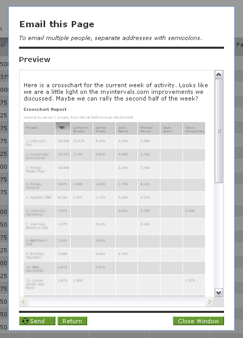
Today we don’t have anything too sexy to announce, but we have overhauled the “email this page” functionality. The previous way we handled email this page did not have a preview. This is one of those rather small items, but if you email invoices, reports, status updates, etc. it can be annoying emailing yourself first to make sure everything looks correct before sending the final email.
Also, the action icons have been overhauled to use space better (and pave the way for direct to PDF – coming in a few weeks):
![]()
When sending an email there is a new preview option:

That shows what the page looks like prior to sending it:

In the grand scheme it is a minor improvement, but often times the right minor tweak can make a big difference in the overall experience. We also removed a few “are you sure” prompts when closing and copying tasks…I can’t believe we didn’t do it earlier.


