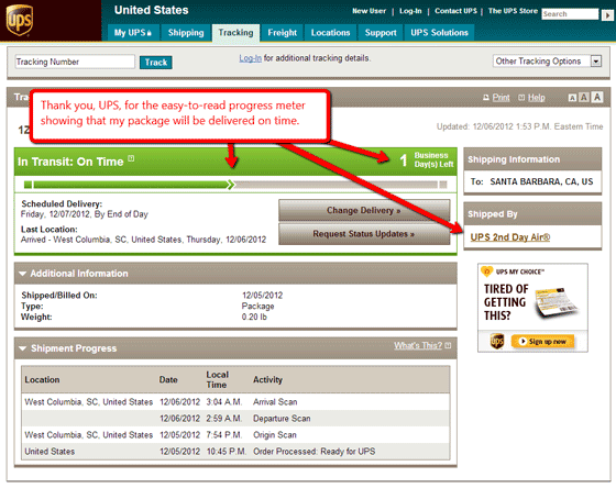
I recently ordered my Raspberry Pi computer. I’ve been checking on the shipping status every few hours with my tracking number at the ups.com web site. One of my biggest pet peeves is when a shipping service say a package is going to arrive in X number of days and it doesn’t. UPS has added some UX elements to help with a frustration, that I am positive, is not unique to myself.

In addition to listing time stamps and locations, UPS has added a progress meter to show how long the package has been on the road (or in the air) and when it should arrive. The big picture. Emphasizing these visuals is a bold statement from UPS, a statement saying we are going to ship your package on time, and if we don’t, neither this page nor our company is going to look good.
When you are web designer trying to create a great UX, strong visuals can often times communicate better than text and numbers.
Thanks UPS!