In this post…
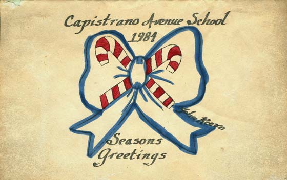
It was in the late fall of 1984. I was in the fourth grade. Nine years old. The teacher had just announced to our class that one lucky and talented young individual would be designing the program cover for the winter holiday performance (Yet another one of those embarrassing ensembles where our teachers would parade us in front of our parents and have us belt out carols). The papers and pencils were handed out and every single one of my classmates began to draw.
Everyone, except me. I was transfixed by the elaborate wintry scenes coming to life on each piece of paper. Snowmen danced through forests of Christmas trees. Strings of lights snaked their way over fences and roofs. Snow-capped mountains loomed over frozen lakes swirling with ice skaters. I looked back down at my blank sheet of paper, defeated before I’d drawn anything at all.
Not sure what to do, I drew two candy canes, crossed in the shape of the letter X. It was different. It was basic. It was selected. I couldn’t believe it. How could a simple sketch stand out from an assembly of elaborate artwork? I was excited. Having my design chosen was just the first step toward producing enough programs for the performance. From here on out it would prove to be a lengthy process, from idea to execution — and it would turn out to be my most memorable lessons in graphic design.
Lesson 1: Keep it Simple
Looking all around at the other artwork that day, I had equated embellishment with talent. The drawings were busy, loud, chaotic. But they were also works of awe and wonderment. That’s great for your parent’s refrigerator, but it’s not graphic design. The graphic designer is tasked with communicating an idea or a concept in the simplest, most understandable and digestible way possible. To that end we speak visually, using typography, illustration, photography, and composition. If any of these detract from the overall message, we’ve failed.
My nine year old creative thought processes churned through the information presented that day and decided that two candy canes were the simplest way to capture the message. The ability to communicate complex ideas in simple images and words is the mark of a good graphic designer.
Lesson 2: Collaboration with Other Designers is a Must
The astute reader will notice that I have not mentioned the blue bow. That’s because it wasn’t my idea. The first thing the grown-ups did with my drawing was to change it. I sat down with the teacher’s aide to finalize the design and the first thing she did was add the bow to the background. That stubborn nine year old was pissed. Why would they change my design? I won. It was my idea, my drawing, I should have the final say.
I was nine and naive. The aide was much older than me, a grown up, and was a talented artist. She knew a lot more about art than I, more than enough to know that including me in the process would be a great learning experience. She was my art director. Looking back as a 37 year old, I realize that she improved my idea.
Learn to collaborate with other graphic designers. Everyone brings something to the table, and some are more talented and experienced than others. Collaboration is a great opportunity to improve your design work. Just try not to let your ego get in way.
Leson 3: Ideas are Worthless Unless Executed
Up until this point, all we had was a drawing of two red and white candy canes with a blue bow in the background. The next step was to print up the hundred or so copies we would need for the performance. And then color each one with a marker. This was 1984. We didn’t have computers or printers capable of producing quality output. And we had only what little money we could squeeze from an elementary school budget, which was next to nothing.
We had a Xerox machine, felt-tipped markers, and four hands. It took a lot of red and blue markers, a lot of paper, and a lot of time to produce enough programs for the winter performance. In the end, I had successfully completed by first design project, creating an idea and following it through to completion. Today, executing an idea is easier than it has ever been, with web site content management tools, color laser printers, and online printing companies who will deliver cheap magnets, postcards and stickers to your doorstep.
Despite how easy it is to get an idea out in front of an audience, many graphic designers still get caught up with the fascination of the idea and rarely move beyond it. Ideas are good. Ideas are great. But ideas are also worthless until they’ve been transformed into something tangible. Without that Xerox machine and felt-tipped markers, my idea would never have materialized. I wouldn’t have had a copy of it to scan for this blog post, much less a blog post to write.


Inspiration and great job framing the lessons on your experience.
Thanks for sharing