 When asked about what goes into a web site design most of us web designers will automatically start talking about color palettes, image formats, UI effects, and of course, Photoshop and its endless array of filters, plugins and effects. What about the design? Where do the ideas and the creativity come from? How does a visual concept floating around in our brain make its way onto the computer screen?
The web medium is a digital one, but all good ideas usually come from analog instruments that have been around for a very long time… pencil and paper. Any good web designer should be a practitioner of sketching page after page of thumbnails while they hash out their creative ideas. Simply put, nothing is faster at capturing and visualizing our creative thought patterns than the trusty old pencil and paper. And it makes the process of rendering a comp in Photoshop much easier if you already know what it is you are designing.
To illustrate the web development process of how a visual web site design goes from an idea to a comp, I’ve scanned a sampling of sketches from a web design project. Scroll down to see how ideas begin as loose sketches, get tighter as they begin to congeal, and ultimately make their way onto the computer screen.
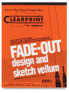
All of these sketches were completed on my paper of choice: Clearprint Fade-out design and sketch vellum. I prefer gridded paper, as it maintains some sense of order while I’m sketching.
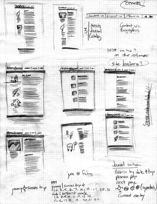
On this first page you can see that I am just exploring some rough layout ideas. In addition, I’m writing down information I want to remember later.
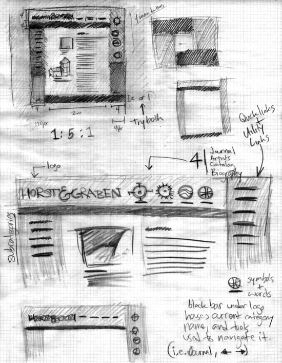
I’ve found some visual elements I like and I’m sketching studies of them to see if they’ll work. It helps to focus on one area of the web site when exploring new ideas, for example, how icons might look in the navigation.
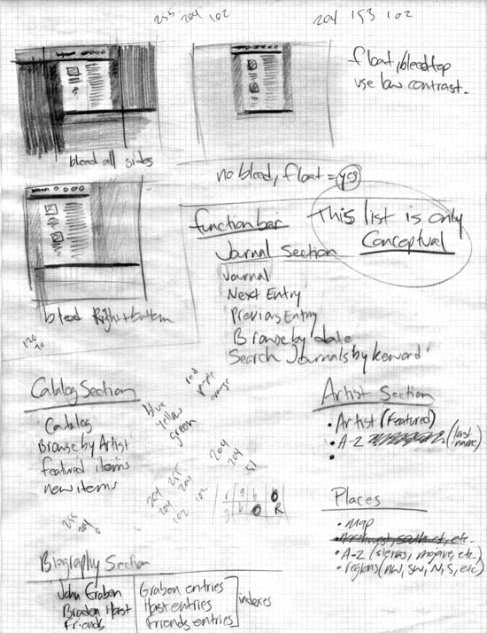
Sketching some ideas on how the web site might look in the context of the web browser using different background treatments. Also taking down notes for what labels and content will appear in each section.
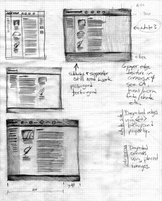
The layout is getting tighter. These sketches are an exercise in how different shades and textures might look. More notes on different ideas to explore.
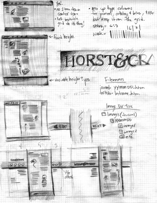
Trying out some unconventional ideas for the site navigation. They were not used but it was still a good exercise to sketch them out. This sketch shows why thumbnails are so powerful. They enable you to explore almost every idea so only the good ones make it to the computer screen.
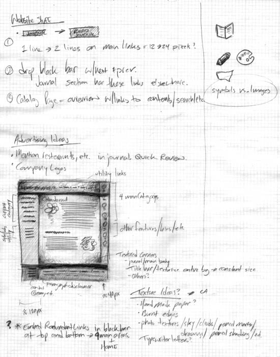
This final sketch shows a layout that will be rendered in Photoshop. The subtle asymmetry of the design could not have been achieved without evolving to this point through previous thumbnails. The notes are more ideas for colors and textures to explore once I’ve started rendering the design.

The design comp! This is the first draft of the comp that will be presented to the client. Looking back you can see how different elements from the thumbnail sketches made their way into the final design.
The more you pencil sketch website designs on paper the faster and better you will become. In addition, you’ll build up a library of sketches that can be referenced on future design projects. Just because one idea didn’t work on this web site design project doesn’t mean it won’t work on another.
Happy sketching!


Yep, this is what I do. I usually go pen and graph paper. I like those soft leads you’re using.
Any good web designer should be a practitioner of sketching page after page of thumbnails while they hash out their creative ideas. … http://www.dezinews.com