The weekly timesheet is the most drab, over-templatized productivity tool that’s ever been utilized in the history of the business world. We’ve tried to keep it fresh by reincarnating it every few generations — from paper timesheets, Excel spreadsheets, and desktop widgets, to its latest incarnation as online time tracking software. Despite weekly timesheets being a universally boring and disliked tool, they are still the most practical method we have to measure time.
In this post…
Whether your goal is more accurate hourly billing or improved productivity, the weekly timesheet is only a tool, not a solution. If we want to make more informed decisions and grow our business, we need to find meaningful ways to analyze the data we’ve collected. Tracking time is like wearing a fitness tracker. It gives us a baseline of our current health that we can use to effect positive change. Here are five helpful visualizations for getting more than just numbers from your weekly timesheets.
 #1
#1
The project centric timesheet
Most timesheets are focused on capturing the number of hours an individual worked each day of the week, but not much more. When we add one more data point, such as the project and/or task worked on, we get a clearer picture of what each person is doing with their time. See for yourself how it works with our weekly timesheet calculator.
Why it’s useful:
The project focused weekly timesheet provides a simple accounting of where our time is going. It’s most useful when used to look back at the last few days. In the context of Agile development it becomes an indispensable tool during daily standup when answering the question “what did I do yesterday?”

#2
The weekly bar graph
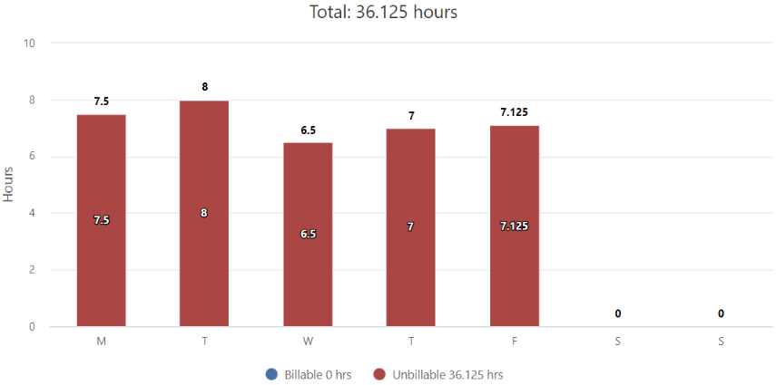
We are creatures of habit and routine, and when we visualize an individual’s weekly timesheet as a bar graph, we’ll see patterns repeat from week to week. In the example below my week is front loaded, with Monday being the heaviest and Friday the lightest. Once I’ve identified a pattern I can start asking why.
For our company, there are two reasons why the weekly timesheet is front loaded. One is that we are working through the smaller residuals that have accumulated over the weekend. The second reason is that many of our customers are international and in later time zones, so by the time our Friday begins they are already headed into the weekend.
Why it’s useful:
Now that we know this, we can and do schedule certain tasks for later in the week when we know they won’t interfere. More importantly, we know to avoid piling on too much work in the beginning of the week that might overwhelm us. Your results will be different.

#3
The weekly summary report
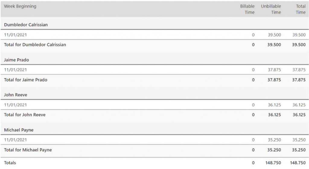
The weekly timesheet is typically a snapshot of one person’s time, but it’s also helpful to pull up a summarized view of the entire team. The weekly summary report provides a rolled up total of each person’s week, as well as a weekly total for the whole team.
Why it’s useful:
A team centric weekly timesheet shows us how the team is progressing through the week. If you happen to be using time tracking alongside Agile methodologies, this report will show the team’s velocity on the current sprint and indicate whether or not the sprint is on schedule.

#4
The pie chart
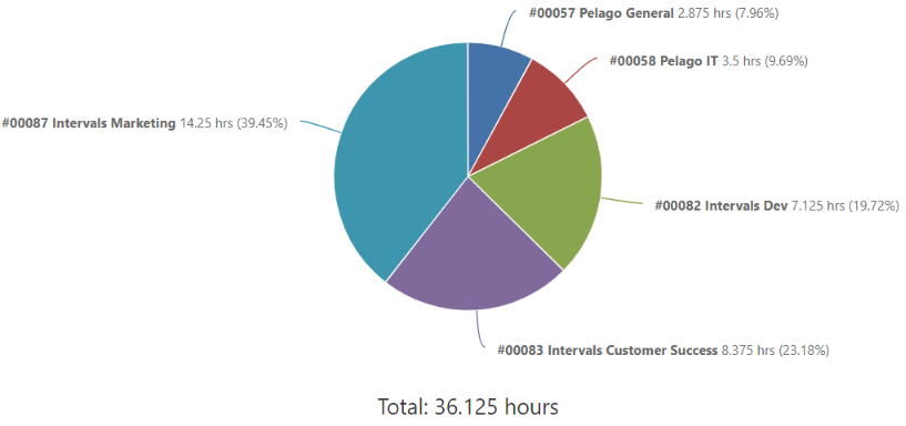
A pie chart visualization of the weekly timesheet will reveal the amount of time spent on each project as a percentage of the person’s total time. The focus is less on the number of hours and more on the quality of each hour. Time is a non renewable resource — we only have so much of it to give — and the pie chart is the best tool for prioritizing our work time.
Why it’s useful:
One of the biggest benefits of time tracking isn’t that it shows us the number of hours a person worked, it’s in showing us where their time was spent. The pie chart tells us if someone is spending too much time (or too little) on a given project. And, because it shows the percentage of a person’s time going to each project, it can reveal a need for better time management.

#5
The pivot table
The pivot table provides an easy and efficient way to summarize a week’s worth of data alongside a detailed analysis of time. In the example above we see the total number of hours our team spent on each project alongside a breakdown of each person’s time. We can see which projects had the most people working on them, and which projects were neglected.
Why it’s useful:
If you find yourself juggling a lot of projects, this report will reveal early on the projects that are slipping through your fingers. It won’t tell you why that’s happening, but it will tell you where to look.


